


Introduction
Introduction
An Introduction to Features

The focus of these feature pages will be primarily directed towards Microsoft Excel, however RitchViewer is not restricted to Excel. Using the Data Selector an ever expanding number of data sources can be utilized. Commercially however; there just happens to be between 800 million Excel users and 1.2 billion Office users all able to get immediate benefit from RitchViewer.
We want to introduce a new paradigm of what a desktop can be.
RitchViewer is not a simple dashboard tool, memory database graphing tool, or Business Intelligence (BI) tool built by a team of rocket scientists. RitchViewer is unique and enables you to explore relationships, gather insights, and reveal the stories buried on your desktop.
The mission of RitchViewer is to impact all sources of data on all products. We have designed and/or tested and applied for patents on PDF files, web browsers, Google sheets, and some more interesting input sources and info-graphical outputs that we will reveal over time. As our new user base, you can have your say on where we should focus our goals; and we will listen.
The following features will walk you from RitchViewer's powerful ability to bring data to life, through the workings of PathFinder, the very unique Smartgraph Error Detection Technology, insights from Second-Order data visualization, and onto our first specialist Pack - RitchViewer Finance Pack.
We hope you are as fascinated with what the desktop can be as we are!
Instant Graphing
Instant Graphing
Instant Graphics
For those first time users, a spreadsheet was just a glorified calculator or a way of laying out a table of data. Now with one-click RitchViewer brings the spreadsheet to life using visualisation and animation. If you are one of the other 400 million Microsoft Office users that barely use or maybe never used Excel; then RitchViewer will change your view of what a spreadsheet is.
Every piece of data is a story waiting to be told; RitchViewer helps tell those stories.
Even if you are one of the other 800 million active Microsoft Excel users, then:
- RitchViewer adds a new dimension to your desktop;
- RitchViewer embraces the new age of instant gratification;
- RitchViewer visualizes and animates everyday information that is presented on the desktop.
In the short video below you can see how easy it is for a novice. Instant gratification means there are:
- No menus to go through
- No placing of fixed charts
- No highlighting arrays of data you want to chart
Just point at a single piece of data & click.

Fast Fact:
"The first set of attorneys that worked on drawing up the patent liked the product so much they asked to use RitchViewer to visualize patent data."
Walking Through Data
Walking Through Data
Walking Through Data
Whether you 'own' the spreadsheet or are trying to master one supplied to you; RitchViewer allows you to simply walk through the data.
- The complex is made simple
- Animation and visualisation helps to identify key variables and relationships
- RitchViewer moves the spreadsheet from a data repository to a source of insights
As you watch this video, see the relationships reach out to you and tell their story. Watch the insights that come from simple animation. Visualizing the data points and their relationships across time, relative to their Pivot Row being "Total Assets" for the Balance sheet. Walking down the balance sheet, and seeing the data from row-to-row.

It doesn't matter what you do with a Microsoft Excel chart, Google Sheets, Apple Numbers or another third-party chart, you just don't get these Insights.
If you are an experienced Financial Analyst; imagine how much this speaks to a client or perhaps an assistant analyst. A picture tells a thousand words.
Fast Fact
"Earlier we discussed a non-Excel user experiencing Excel financial models for the first time. With the aid of RitchViewer Finance Pack she now talks like a seasoned analyst discussing Balance Sheet strength, Working Capital impacts on valuation, What to do with excess capital; yet she is still a novice."
Collaboration
Collaboration
Collaboration
We are 90% visual beings
Around 100 thousand billion images circulate on Facebook (77% of the total shared content on Facebook) and 6 thousand billion in Flickr. The image is, without doubt, the preferred content by users.

Whether you are 5,000 miles or 5 feet away, RitchViewer lets you share stories and explore insights through animation and visualisation. This is not just a presentation of fixed data and fixed visuals, this is what RitchViewer calls collaboration. Through story telling RitchViewer allows you to cultivate a shared experience and for business this means shared productivity.
Changing Behaviour Inside Enterprises
“Managers make better decisions when key data are presented visually”
Thomas H. Davenport a visiting professor at Harvard Business School, the President’s Distinguished Professor of IT and Management at Babson College, and a research fellow at the MIT Center for Digital Business

Our understanding of all kinds of information is shaped by our physical interaction with that information. Co-authoring has its place in organisations, but the majority of projects are worked on separately with a team coming together to share or explore insights. RitchViewer's unique characteristics of embracing modern day social communication's instant gratification and allowing teams to walk together through data in real-time opens the doors to greater working collaboration.
- You no longer need to prepare slide decks to explain what the data is telling you
- You no longer need to be locked into fixed charts for explaining data
Just point, click, share, discuss, evaluate, explore - as a team.
As you go through the rest of the features, think about how you can use these unique features to share your productivity and creativity.
Fast Fact:
RitchViewer is developing tools that allow you to share you insight without the source data.
In the same way you might share a Google slide presentation, these new tools will allow you to share visual output but with the difference that you have the dynamics to focus conversation on data key to the story needed for working together.
Smart Dates
Smart Dates
Smart Dates
Whether you are a model owner or a reviewer, you need to be able to separate periods.

RitchViewer Smart Dates has been designed to search the headers and separate this data visually in real-time.
Many models utilize groups where they can collapse non-annual data, and/or carry "Summary" sheets linked back to a source sheet to cater for seeing just annual data.
As you are aware, "Summary" sheets are fraught with danger of poor links or updates being made on the "Summary" sheet and not on the underlying data. Groups can be cumbersome in opening and closing without loosing your place in the model.
RitchViewer Smart Dates instantly determines whether a model has both annual and non-annual data and automatically offers you just the annual data where you can analyse year-on-year trends. If you swipe your mouse down, then you can view just the non-annual data and look for seasonality across these periods. A further swipe down reveals both together - as you would get if this was just a Microsoft Excel, Google Sheets, Apple Numbers, or other 3rd party charts. You can see in the video below, for this example of Revenue, that there is little information in a chart that shows both quarterly and annualised revenue. Simple and quick separation of the periods leads to greater insights into the model.

Fast Fact
For the technically minded, we have created a mechanism that does 'Advanced Header and Label Analysis'. Going through a number of different models revealed the need for Multi-Column Labels.

Similarly, a large number of financial models were processed to create a Full Year versus Partial Year algorithm that yields RitchViewer Smart Dates.
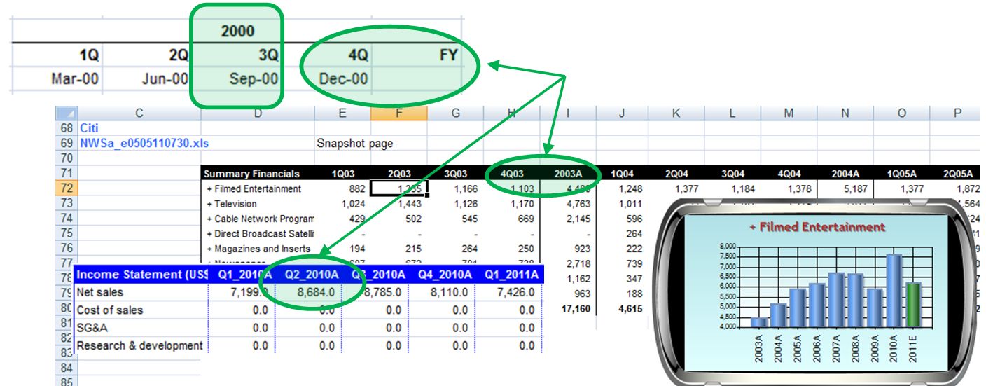
Chart Selector
Chart Selector
Chart Selector
As well as the standard charts, there are a variety of RitchViewer SmartCharts that are outside-the-box.
When you look at data, the 'Change' from value-to-value can be more important than the actual numbers. RitchViewer SmartCharts include charts that let you see this change, such as step charts, change in value, percentage change, and growth. There are also charts that let you see the difference between historic averages and forecast averages, accumulate values, compound interest or growth percentages, and even show year-on-year seasonality.
The Chart Selector lets you walk through chart grouping. Press play to view a group of 'favourites' that I like to use.

Growth Chart
Any business that looks at Sales is just as interested in how sales are growing as the absolute value of sales. As you watch the selector rotate through the RitchViewer Smart Charts you will notice a growth chart that supports seeing both the absolute numbers, plus a secondary line chart showing growth.
Step Chart
You will also notice a step chart which is very valuable when looking at a variety of data, for instance Return on Equity or Return on Assets.
Swipe Between Charts
Swipe Between Charts
Swipe Between Charts
Unlike any other product, RitchViewer associates your data with more than one chart.
RitchViewer uniquely associates multiple charts with the selected data through Keywords matching and other mechanisms explained later. What this means, is that:
With a side-swipe of the mouse you can move through charts that fit the dataset.
If you watch the video closely, you will see RitchViewer swipe between a bar chart, line chart, step chart, change in value, change in percentage, and especially one of RitchViewer's second-order charts. This Second-order chart is not the selected data of "Total Current Assets", but a chart of "Total Current Assets / Total Assets". This chart goes beyond that and compares the historic average of this ratio against the forecast average.

History - Forecast
History - Forecast
History - Forecast
Within financial modelling, to perform deeper analysis, you need to be able to see the difference between what has been and what is forecast.
RitchViewer Smart Charts automatically analyses the column labels and row headers. It then separates the data allowing visual interpretation between historic and forecast periods. The chart below highlights the insights that can be gained. We not only see the absolute value dipping in the start of the forecast space, but as this is balance sheet data, we also see from the line chart how the historic & forecast values relate to Total Assets. In the end, the rising absolute value in the Analyst's forecast appears to maintain at around 6% of Total Assets.
Imagine the chart without the separation, would there be any visible Insights?

Rotate between Rows & Columns
Rotate between Rows & Columns
Rotate between Rows & Columns
With a simple mouse movement you can easily move from walking down rows to alternatively walking across columns.
The following video shows a model for Boeing company, and the revenue it makes from New Plane sales. In the opening chart you see the Total New Plane Revenue year-on-year grow from a range of 20-30 billion for 10 years to a forecast 66 billion.
Once the chart is rotated a different perspective is given. Here you watch as the user walks from column-to-column or in data perspective from quarter-on-quarter. Now the impact on New Plane Revenue from different airliner models, becomes evident across time thanks to the uniquely patented RitchViewer.

You can see the two airliner models that dominate Sales Revenue with a steady growth from the Boeing 737 coupled with the new growth of the Boeing777 airliner.
Fast Fact:
As with all the data shown by RitchViewer, these numbers are for demonstration purposes only. RitchViewer does not hold itself out to be licensed for supplying investment information.
Reveal the Hidden
Reveal the Hidden
Reveal the Hidden
As a Manager I am delivered many different third party models, so this feature of Revealing the Hidden is one of the most valuable tools for Insight.
In the short video below, you can see that the analyst's model only has accessible columns for FY11 to FY18. You could work through the model and unhide more columns, but RitchViewer does all that for you. With a key stroke, RitchViewer is able to reveal the hidden data so the new series for 'Cash & Cash Equivalents' has another decade of data points, now from FY01 to FY18.
The insight gained from extending the years shows a different long-term relationship between 'Cash & Cash Equivalents' against 'Total Assets' than the shorter period of FY11 to FY15. As a contrast to the Analyst's sudden increase in forecast years of FY16 to FY18.
Questions can then be raised: Is this a structural change for the company? Has the Analyst made mistakes in the model? What were the drivers for the increase, and how do I explore this?

Pathfinder
Pathfinder
Pathfinder
PathFinder allows you to not only walk down a formula, but also to see each data point in context of its surrounding data points.
Let me say that again: Not only do you see the formula breakdown, but you see how each part of the formula relates to its surrounding values.
As you watch the video, the first thing you see is the user double-clicks on the FY18 column for "Total Current Assets". From there as they drill-down, PathFinder shows the value, the formula, and importantly the Label for each new component. In parallel RitchViewer shows how that value relates with its surrounding. This is unique, and yields amazing insights. {This technique is registered in our patent.}

Fast Fact
PathFinder easily walks between sheets and workbooks. Watch the video more carefully and you will see many of the Cells are on the 'CF' sheet whereas we started on the 'BS' sheet. When PathFinder reaches a formula that is in an unopened workbook, then PathFinder will offer to open that new workbook so that it can continue telling you stories.
SEDT
SEDT
SEDT
Smartgraph Error Detection Technology
Smartgraph Error Detection Technology is just that.
As RitchViewer walks through the data, a rules-based system will visually highlight anomalies based on the installed "Pack" you are running, the Keywords associated with the Label, and any other data relationships it can establish.
As you watch the video below, you can see that once SEDT is turned on in RitchViewer, anomalies are highlighted. In the video, the user is walking down a Balance Sheet. When the users walks to the row labelled "PP&E" meaning "Property Plant & Equipment", SEDT highlights FY18E with a red border. For those reading who are not financially minded, "Property Plant & Equipment" are the company's assets. If you look at the graph for "PP&E", you can see steady growth through all the companies history. In the forecast years, the Analyst suddenly has the company assets falling. Simple observation tells you that this is most likely wrong. As we are running RitchViewer Finance Pack, the rules based system for Fixed Assets on a balance sheet is applied and Smart Error Detection Technology presents the modelling error to you.

The video stops at this point, but the story does not. The unique combination of Smart Error Detection Technology, PathFinder and RitchViewer allows you to drill down and see the drivers for the error.
Fast Fact
We pronounce SEDT as 'Sed-It'.
SEDT was invented by Cameron Ritchie as a tool when finishing his Master of Science in Theoretical Chemistry which straddles the vibrant interfaces between chemistry, physics, material design, and biology. His project encompassed many applications of mathematical and computational techniques in order to predict aggregation conditions of various particles with applications in industry chemical processes and the design of drug delivery vehicles.
So when you see Financial Models in our examples, remember the origin of this product and imagine the future.
Second Order Charts
Second Order Charts
Second Order Charts
RitchViewer allows you to look at data in a different way.
Microsoft, Google and other third party products supply charts that present the raw data. At RitchViewer we focus on the results needed for analytics and insights.
Growth
When you look at Sales or Revenue, you don't just want to see a chart of those numbers, you also want to see how the Sales are growing.
In this example RitchViewer supplies the raw 'Total New Plane Revenue' data in column format but just as importantly a line chart associated with the secondary axis showing growth in Revenue year-on-year.
Historic Average Versus Forecast
When you look at ratios you want to see historic averages against forecast. In the finance industry, this means any sort of margin, such as EBIT Margin shown in the image. It could equally apply to Payout Ratio, Debt/Equity, Capex/Sales or Capex/Depreciation.
See in the chart on the right how their is a step up in historic 'EBIT Margin' versus forecast. A good Analyst would ask 'Why?' Is this a model issue or a structural change?
Step Charts
Their are a multitude of reasons for wanting to see incremental movements between data points. One of the tools to do this is the step chart. In the finance industry a common set of metrics for this type of chart would be Return on Assets, Return on Equity, or Return on Capital Employed. In this example, we are showing the same data as in the previous growth chart to allow you to compare the different chart attributes.
Change in Value
Again, using the 'Total New Plane Revenue' data, we can look at the absolute change in value between each period. In this case we are not seeing what the absolute 'Plane Revenue' is, but the dollar value between each year. So in 2012 we saw the largest increase in Revenue occur. What is more, there was not a corresponding decline in 2013, so that step up in Revenue seems to be structural / permanent. As an Analyst, you can then ask the question Why?
Change in Percent
This chart is the same data as in the 'Change in Value' chart, but we get to see percentage change. What you saw in the last chart was that 2012 had the largest step up in Revenue, but was it the biggest movement for the company? The answer is no. Although with an absolute value of $7.9b (which is less than $13.2b in 2012), in 2006 we saw a 46.5% change in Revenue over the 42.8% change in 2012. Of course the second point of interest is the negative change two years later in 2008. Will that pattern repeat or was that just a result of the Global Financial Crisis (GFC)?
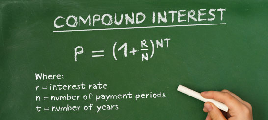
Compounding and Accumulating
Sometimes you are give percentage data, which accumulates year-on-year. You cannot just add the percentage up as they build on each other, you need to compound them.
Alternately you might be given data that accumulates over time, like monthly sales - so you want to see a chart that build on these sales month-by-month.
In the following video, you see examples of both compounding and accumulating second order charts along with the alternative way (proof) of achieving the same outcome in a spreadsheet. You can see in the video that within RitchViewer, you just click on the data and choose the compound line chart to instantly visualize compounding growth over the supplied years. This can of course also be done on the spreadsheet, so we have also recreated what you would need to do to get the same results from Microsoft Excel, Google Sheets, or Apple Numbers - effectively applying the formula on the chalk board for each period in consecutive cells.
Similarly, if you had say monthly sales and you wanted to see how these sales accumulates over time, then with one-click RitchViewer can do just that. Again, we have recreated what needs to be done on a spreadsheet to get the same results.
In both cases you would need to create a second order series on the spreadsheet, calculate the results, then graph them.

Seasonality
When looking at time-series data, you want to be able to compare year against year. Am I seeing the same pattern in monthly sales from a retail store? Are airline passenger load factors seasonal, and if so what should we expect in the coming months?
This chart shows a two year cycle of passenger load factors for Cathay Pacific on their "South East Asia & Middle East" route. Looking at the data, we only have load factors out to September in 2014. Assuming 2013 (blue chart) is a typical year, then this chart gives us an indication of what to expect in the following months in 2014.
We can of course add more years to see if there is a consistent pattern of upward passenger load factors in the quarter between September and December each year.
Fast Fact
RitchViewer has many more Second Order charts and they are growing. We will leave you with a video of how you might examine a balance sheet using a concept we call Pivot Row.
In the video below, we have set "Total Assets" as our Pivot Row. What this means is that when we look at other rows in the same block, each will be presented as a percentage of "Total Assets". In accounting, this would be called a common size or base 100 balance sheet.
The video starts out showing the focus row's data on the left axis as a column chart with the a line chart of the <focus row> / "Total Assets" against the right-axis. We then swipe between the charts to show a second order chart which doesn't show original data at all. It shows columns of the <focus row> as a percentage of "Total Assets"; plus lines indicating the average historic and average forecast of the <focus row> / "Total Assets". For the layman, the chart allows you to see where the movements in Assets occur across time, and answer questions like "Are the people who owe me money taking up more of my Balance sheet resources?", "Are my Fixed Assets growing relative to the rest of my Balance Sheet?"

Keyword Association
Keyword Association
Keyword Association

One of the core aspects of RitchViewer is how we match charts and info-graphics to Keywords. As you walk through your data, RitchViewer is constantly interpreting row and column labels, as well as surrounding data to decide the most appropriate first chart.
RitchViewer matches Labels or part Labels with Keywords that contain one or more charts for data association. The concept of more than one chart associated with a Keyword is very important and very unique. That's why we put it in our patent.
In the image on the left, the Keyword 'Sales' is matched against six different chart types. So if you walk through data that has the word 'Sales' somewhere in the associated Label, RitchViewer will offer you the 'Growth' chart. With the swipe of a mouse you can then move between all six charts listed.
This does not block you from using the Chart Selector to choose a different way to look at your data, it just facilitates ease of moving through your data.
Worksheet Chart Override
There are times where you do not want Keywords to come into affect, but rather you want set charts associated with a source document, such as a worksheet.
In the video below, we are looking at monthly statistics for the airline Cathay Pacific. Rather than allowing Keyword association to occur, we have specified four charts to associate with this worksheet. Those charts being 'Forecast Polynomial', 'Line', 'Forecast Linear', and 'Seasonality' charts, as shown on the right.


Packs
Packs
RitchViewer Packs

RitchViewer as a standalone package is a very powerful mechanism to explore insights or just graph data in real-time. It certainly redefines the desktop.
We have started to create specialised "Packs" to facilitate different industries and roles. Our first "Pack" is RitchViewer Finance Pack but we are not stopping there. Based on the needs of our wider group of users, we will be extending to other "Packs", a sample of which is shown on the left hand side.
What does a Pack Mean?
For RitchViewer Finance Pack; It means some specialist charts and info-graphics that may only be relevant to sections of the finance industry.
It also means that we have worked through Keyword associations for financial models. For instance, when you look at Sales or Revenue in the finance industry you always want to see growth. When you look at 'Return on Assets' or 'Return on Equity' you want to see a step chart. When you look at a margin, like 'EBIT Margin', or say 'Capex to Sales', you want to compare history versus forecast margins.
The RitchViewer Finance Pack caters for these needs and more.
Data Selector
Data Selector
Data Selector
The focus of the proceeding features has been on Microsoft Excel. RitchViewer is not restricted to Excel, there just happens to be between 800 million Excel users and 1.2 billion Office users. The mission for RitchViewer is to impact all sources of data on all products. We have designed and/or tested and applied for patents on PDF files, web browsers, Google sheets and some more interesting input sources and outputs.
The RitchViewer Data Selector lets you drag & drop, or cut & paste data onto RitchViewer. Once this happens your data is loaded into a grid on the Data Selector, and you can walk through the data just the same.
In the case of the image on the right, the user has dragged the file 'Table of data.txt' onto RitchViewer, which has caused the Data Selector to appear with that information. The User has then clicked on 'Return on Equity' and RitchViewer Finance Pack has selected a step chart to examine this data.